The Branding of Press & Still

The name “Press & Still.”
What’s in a name? In our case, it’s everything. It represents the purity of our ingredients. Our goal is to make unique, beautiful botanical perfumes and skincare products using the highest quality aromatherapy-grade essential oils, extracts and carrier oils that we can find. This means sourcing oils that have been steam distilled or cold pressed. We typically steer clear of oils that have been solvent extracted (absolutes) because they contain traces of the solvent used during extraction. However, we’ve recently expanded our collection of ingredients to include oils extracted using supercritical carbon dioxide, because although this method uses CO2 as a solvent, it’s non-toxic and there’s no trace of it in the final product.
 Copper spiral symbol
We wanted to create a symbol that conveyed the purity of our ingredients. Also, having grown up playing with the Spirograph, we are drawn to curves that overlap and form intricate patterns. Our copper spiral design pays homage to the Spirograph, and is an abstract version of the condenser in copper stills used to distill certain essential oils. (Side note: check out our Pinterest board that includes vintage spiral artwork from Japan, Andrea Minini’s playful vector illustrations of animals, and the amazing harmonograph pieces by London artist Anita Chowdry.)
Deep cerulean color
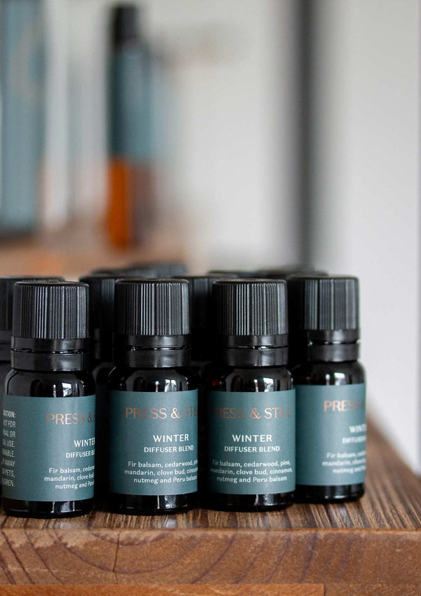
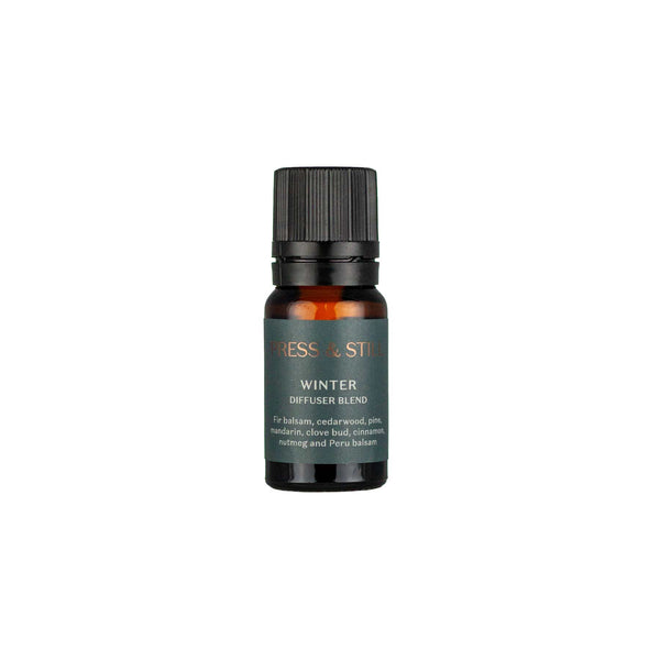
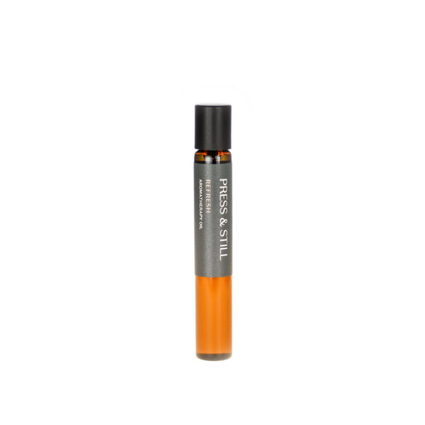
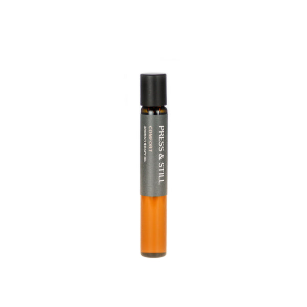
We chose deep cerulean as our primary color, mainly because we’re coastal folks at heart and we miss the sea. This color is multi-dimensional. In most lights it looks blue. But when the sun hits it, it turns almost a dark emerald green, much like when the sun shines on the ocean. The deep hue is fitting also because our scents are quite deep and earthy.